How are predicted probabilities distributed within and across groups?
After generating predicted probabilities for your test data, one of the first valuable steps is to examine how those probabilities are distributed — both within individual sites (like schools, clinics, or program locations) and across sites. This helps answer questions that stakeholders will inevitably ask:
- Is the population mostly low-risk, mostly high-risk, or mixed?
- Are some sites much higher-risk than others?
- Where might interventions or resources be most needed?
Understanding these patterns is also essential for communicating your results clearly. Visualizations of predicted probability distributions can make complex model output accessible to non-technical audiences.
Distribution within a single group
The plot below shows how predicted probabilities of dropping out of high school are distributed within a single school. Each student has one predicted probability between 0 and 1; the density curve shows how those values are spread across that range.
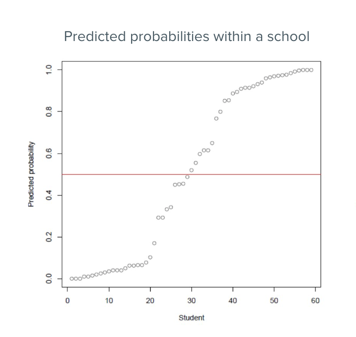
In this school, a few patterns stand out:
- Many students cluster at low predicted risk (below 0.25) — they are unlikely to drop out.
- A smaller group has high predicted risk (above 0.75) — these are the students the model flags as most in need of attention.
- A notable share falls near 0.5, where the model is most uncertain about their outcome.
When communicating this plot to stakeholders, walk them through what the x-axis represents and highlight any notable clusters. It is worth addressing what a value near 0.5 means: not that a student will definitely drop out, but that the model is uncertain — which itself may be useful information for targeting follow-up.
Distribution across groups
The next plot extends this view across many schools at once, making it easy to compare sites.
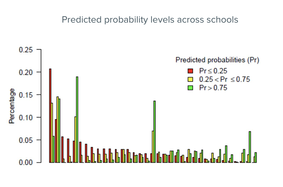
For each school, students are grouped into three predicted risk categories:
- Low risk: predicted probability ≤ 0.25
- Moderate risk: predicted probability > 0.25 and ≤ 0.75
- High risk: predicted probability > 0.75
This view quickly reveals which schools have the largest concentrations of high-risk students — and which schools are larger or smaller overall. For stakeholders responsible for allocating support across sites, this kind of visualization is especially useful for deciding where to focus first.
When presenting this plot, be ready to explain the thresholds used (0.25 and 0.75) — stakeholders will want to know how those cutoffs were chosen and what they imply for decisions. Threshold selection is covered in more detail in the Selecting a threshold section.