Who has low or high predicted probabilities?
The previous page asked how predicted probabilities are distributed within and across groups. This page flips the question: instead of looking at where probabilities fall, we look at who ends up with low or high predicted probabilities.
In other words — what do high-risk individuals tend to have in common? And how does that differ from low-risk individuals?
This kind of analysis is valuable for two reasons:
- Program design: If high-risk students share certain characteristics — like high absenteeism or low reading scores — this can point toward what kinds of interventions might help them most.
- Communication: Showing stakeholders who is flagged as high-risk makes abstract predicted probabilities more concrete and interpretable.
Looking at characteristics within risk groups
One useful approach is to examine how individual characteristics are distributed across risk groups. The plot below illustrates this for the school dropout example, showing how absenteeism levels vary among students in each predicted risk category.
Students with high predicted dropout risk have much higher rates of absenteeism compared to low-risk students. Patterns like this help program staff understand who is being flagged and why — and can point toward areas for intervention design.
An important caution: Finding that a characteristic is common among high-risk students does not mean that characteristic causes the outcome. Absenteeism may be strongly associated with dropout risk, but many factors contribute to a student’s situation, and correlation is not causation. This distinction matters when communicating findings to stakeholders, who may be tempted to treat these patterns as direct levers to pull. Frame your results carefully: these are associations observed in your data, not causal claims.
Considering multiple characteristics at once
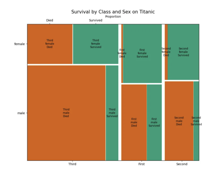
The approach above works well for examining one characteristic at a time. When you want to explore several characteristics simultaneously, additional visualization strategies — such as mosaic plots or faceted bar charts — can help surface more complex patterns. The key is to choose a visualization that your audience can read intuitively, and to guide them through what they are seeing rather than leaving the chart to speak for itself.
When communicating these results, focus on patterns that are most actionable for the program. Highlight where high-risk students are concentrated, and use the findings to prompt productive questions about program design — not to make deterministic claims about any individual student.